
Let’s talk about making websites that people actually want to spend time on. You’ve probably landed on a website and clicked away faster than you can say “bounce rate.” We’ve all been there. The good news is, it doesn’t have to be that way. Effective web design isn’t rocket science, but it does require some thoughtful planning and a genuine understanding of your audience. So, how do you maximize user engagement through good web design? It boils down to creating a seamless, intuitive, and valuable experience that keeps visitors coming back for more.
Think of your website like a magazine. Where does your eye go first? Probably to the biggest headline or the most striking image. That’s visual hierarchy in action, and it’s crucial for guiding your users to what you want them to see. If everything on your page shouts for attention, nothing really does.
Making Key Information Stand Out
The most important stuff—your main call to action, crucial product details, or a compelling headline—needs to be the strongest element on the page. This doesn’t always mean bigger. It can be about color contrast, placement, or using white space effectively.
The Power of White Space (Or Negative Space)
It might sound counterintuitive to dedicate space to nothing, but white space is your friend. It gives elements room to breathe, making your content easier to scan and understand. Cramming too much onto a page overwhelms users.
Creating a Natural Reading Flow
Users tend to read in specific patterns, often an “F” shape or a “Z” shape. Design your pages with this in mind. Place your most important information at the top left, where the eyes naturally start. Use headings and subheadings to break up text and make it scannable.
Strategic Use of Color
Color is a powerful tool. It can evoke emotions, draw attention, and even guide navigation. Use contrasting colors for calls to action but be consistent with your brand colors throughout. Avoid jarring color combinations that make reading difficult.
For those interested in enhancing their web design skills, a great resource to explore is an article on effective user interface design principles. This article provides valuable insights into creating intuitive and visually appealing interfaces that can significantly improve user experience. You can read more about it here: Effective User Interface Design Principles.
Speed Matters: Why Loading Time is Your Engagement Nemesis
Ever waited for a website to load for what felt like an eternity? You probably hit the back button. In today’s fast-paced digital world, users have zero patience for slow websites. Every second counts, and a sluggish site is a direct route to lost engagement.
Optimizing Images for the Web
Large, unoptimized images are one of the biggest culprits behind slow loading times. You can significantly improve speed by resizing images appropriately and compressing them without sacrificing too much visual quality. Tools like TinyPNG or JPEGmini can be lifesavers here.
Minimizing Code Bloat
Complex or inefficient code can bog down your site. Regularly review your website’s code for unnecessary scripts, plugins, or bloated CSS. Think of it as decluttering your digital attic – it makes everything run smoother.
Leveraging Browser Caching
Browser caching allows users’ browsers to store parts of your website locally. This means returning visitors won’t have to re-download everything, significantly speeding up their experience. Most web hosting providers offer easy ways to enable this.
Choosing a Reliable Hosting Provider
The foundation of your website’s speed is your hosting. A cheap, unreliable host will always result in a slow website, no matter how well you optimize everything else. Invest in a hosting plan that can handle your traffic and provides good performance.
Navigation That Doesn’t Require a Map
If users can’t find what they’re looking for, they’ll leave. It’s that simple. Intuitive navigation is the backbone of good user experience. It shouldn’t feel like a treasure hunt.
Clear and Consistent Menu Placement
Your main navigation menu should be prominently displayed and easy to find on every page. Common places are at the top or along the side. Ensure its labels are clear and concise – nobody wants to guess what “Resources” actually contains.
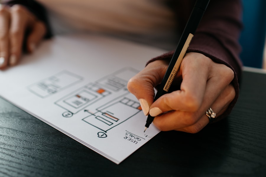
Logical Information Architecture
Before you even start designing, map out how your content will be organized. Group similar information together and create a clear hierarchy of pages. This internal logic makes it easier for users to predict where they’ll find things.
Effective Internal Linking
Linking relevant pages within your website helps users discover more content and keeps them engaged. It also strengthens your site’s search engine optimization (SEO). Think about what other information would be useful to someone reading a particular page.
Search Functionality That Works
For larger websites, a robust search function is essential. Make sure it’s easy to find and delivers accurate results. Users often turn to search when they have a specific need, and a poor search experience can be incredibly frustrating.
Content That Speaks the User’s Language

Great design can only take you so far if the content is unclear, boring, or irrelevant. Your words and visuals need to resonate with your audience and offer genuine value.
Understanding Your Target Audience
Who are you trying to reach? What are their needs, pain points, and interests? Design and content should be tailored to them. Write and design for them, not for yourself or some abstract idea of what a website “should” be.
Concise and Scannable Copy
People don’t read online the same way they read a book. They scan. Use short sentences, short paragraphs, bullet points, and clear headings to make your content easy to digest. Break up large blocks of text.
Engaging Visuals Beyond Stock Photos
While stock photos can be placeholders, custom photography, illustrations, or even well-produced videos can elevate your content and make it more memorable. Visuals help tell your story and break up text.
Calls to Action That Are Clear and Compelling
What do you want users to do next? Whether it’s signing up, making a purchase, or contacting you, make your calls to action (CTAs) unmistakable. Use action-oriented language and make them visually distinct.
When exploring the intricacies of web design, it’s essential to consider how user experience can significantly impact a website’s effectiveness. A related article that delves into this topic is available at TDWAS, where you can find valuable insights on optimizing your design for better engagement and usability. Understanding these principles can help you create a more intuitive interface that resonates with your audience.
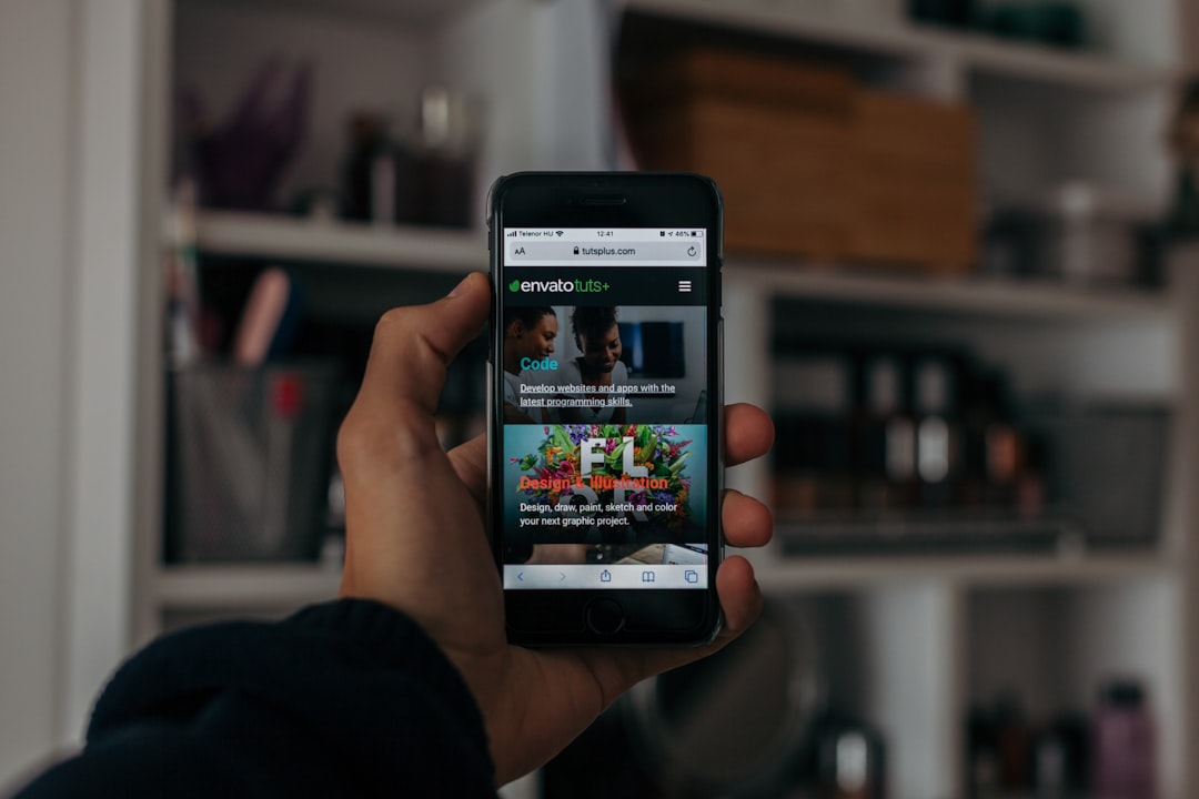
Mobile-First Design: It’s Not Optional Anymore
| Aspect | Metric |
|---|---|
| Page Load Time | 3 seconds |
| Mobile Responsiveness | Yes |
| SEO Optimization | 80/100 |
| Accessibility | WCAG 2.1 AA |
If your website isn’t beautiful and functional on a smartphone, you’re missing out on a huge chunk of your audience. Mobile-first design means prioritizing the mobile experience from the very beginning of the design process.
Responsive Design is Non-Negotiable
Responsive design ensures your website adapts gracefully to any screen size – from a tiny phone to a large desktop monitor. Elements will resize, rearrange, and often hide or appear as needed.
Touch-Friendly Interactions
Buttons and links need to be large enough to be easily tapped with a finger, and there should be sufficient spacing between them. Avoid small, fiddly elements that are impossible to interact with on a touch screen.
Performance on Mobile Networks
Mobile users often have less stable or slower internet connections. This brings us back to speed. Optimizing for mobile also means ensuring your site loads quickly even on less-than-ideal networks.
Simplified Navigation for Mobile
While desktop sites might have complex mega-menus, mobile navigation needs to be streamlined. Think about common patterns like hamburger menus or bottom navigation bars, but ensure they are intuitive and accessible.
The Human Element: Building Trust and Credibility
People buy from people they trust. Your website is often the first point of contact, so it needs to project professionalism, transparency, and a commitment to quality.
Clear Contact Information
Make it incredibly easy for people to get in touch. Display your phone number, email address, and physical address (if applicable) prominently. A dedicated “Contact Us” page is standard practice, but having key details visible elsewhere can be a bonus.
Social Proof and Testimonials
Showcasing positive reviews, testimonials, or case studies from satisfied customers can significantly boost trust. Real people talking about positive experiences are far more convincing than self-promotion.
Professional and Error-Free Content
Typos, grammatical errors, or outdated information can quickly erode credibility. Proofread everything meticulously. If design elements are broken or links don’t work, it sends a signal of carelessness.
Secure Website Practices (HTTPS)
Ensuring your website uses HTTPS is a fundamental trust signal. It encrypts data between the user’s browser and your server, protecting sensitive information and reassuring visitors that their privacy is valued.
Iteration and Analytics: You’re Never Truly “Done”
The job of web design isn’t finished once the site is live. To truly maximize user engagement, you need to constantly monitor, analyze, and refine.
Tracking User Behavior with Analytics
Tools like Google Analytics provide invaluable insights into how users interact with your site. You can see which pages are popular, where users drop off, and how they navigate.
A/B Testing for Optimization
Don’t guess what works best; test it. A/B testing allows you to present different versions of a webpage element (like a button color or headline) to different segments of your audience and see which performs better in terms of engagement.
Gathering User Feedback
Sometimes, the most direct way to understand user needs is to ask them. Surveys, feedback forms, or even informal chats can reveal pain points and suggestions you might have missed.
Responding to Trends and Changes
The digital landscape is always evolving. New technologies emerge, user expectations shift, and design trends change. Staying adaptable and willing to update your site ensures it remains relevant and engaging.